Building A Micro:bit Pendulum to Simulate in Python
A Partner Project By Elysia Chang & Liliko Uchida

Part 1: Build a Pendulum
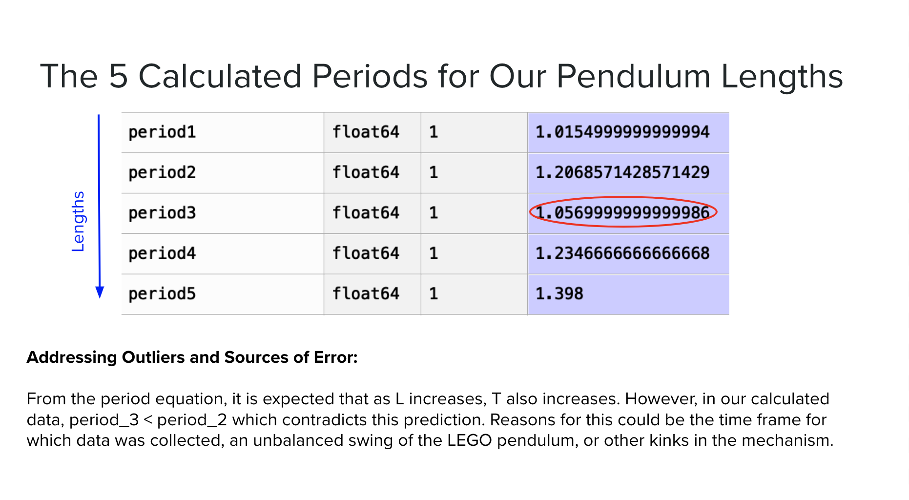
We had 5 lengths for our Micro:bit pendulum measured from the point of rotation to the center of mass of the pendulum. The lengths in code were represented in meter values to remain consistent with metric units.
12 inches (0.3048m)
14 inches (0.3556m)
16 inches (0.4064m)
18 inches (0.4572m)
20 inches (0.508m)
Part 2: Theory-Based Equation Model
We had three main assumptions in this project:
The pendulum is massless.
The pivot point is frictionless.
Air resistance is non-existent.
In the real world (i.e. LEGO built pendulum model), it is impossible to satisfy these conditions, as materials to build always have mass and the weight of the pendulum creating a force on the pivot point will guarantee friction.

A graph of predicted periods per each pendulum length. This slight upward curve indicating a square root function is expected because the equation for the period of a pendulum is 2pi*rad(l/g)
Part 3: Collection of Real World Data
We used a logger + receiver system with our Micro:bit pendulum to simulate & collect the real world data. The purpose of this was to practice using code that records real data from real sensors and then viewing that data in Python (frequently called a data logger).
Data loggers are used in many fields of science and engineering to help collect volumes of experimental data that would be impractical to collect manually. Data loggers can be used to collect data points over time, for example, tracking the chemical properties and dissolved solids levels in a river over many months to see how storm drainage affects the water quality.
Data loggers can also be used to collect data very quickly and frequently, for example, recording the forces and strains experienced on the structure of a novel wing being tested in a wind tunnel.
For this step in the project, we used two Python files: Logger.py (code for a data logger which should wirelessly send your measurements to a receiver plugged into your computer) and Receiver.py (code for the receiver plugged into your computer).
The operating instructions for the code is as follows:
Flash one microbit with logger.py and plug into battery
Flash other with.py and leave plugged into computer
Open REPL and Plotter.
Press reset button on receiver. ‘Program Started’ should print in REPL
Press reset button on logger.
Press ‘A’ button on logger to start logging. Plotter should start displaying data, Logger should have solid heart and receiver should have blinking heart
Press ‘A’ button again to stop.
Close plotter and REPL and file should appear in data_capture folder. (This is located in the mu_code folder which is most likely in your Documents folder.)
Part 4: Analysis of Results
Once we had our Micro:bit data logger working, we needed to write another program on our computers to read, analyze, and visualize our data. For each data file we were able to:
Plot Acceleration vs Time
Required plotting the essentially raw data from the micro:bit
Used the real recorded time data from the data logger (in seconds)
Selected which acceleration axes are the most meaningful
Calculate and plot theta vs time
Required using physics to calculate theta (angular position) from acceleration and plotting that theta over time
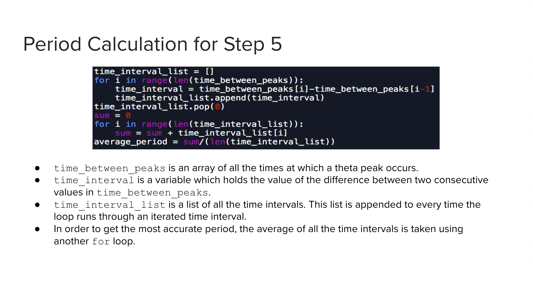
Calculate the period of the pendulum
While physics tells us that the motion of a pendulum is sinusoidal, the actual data we collected will not be a perfect sinusoid. There was noise in our data as shown in the graphs below.
One easy and fairly effective way to remove outliers is with a median filter. A filter is a type of signal processing that helps to remove noise and leave us with more usable data. We looked at a certain number of points around a point and replaced that center point with the median of the range.
To detect the peaks, we used another SciPy function called find_peaks. This function returns the indices of all the points that are local maxima, meaning the element before and after it are both smaller. Once we had the indices of peaks, we could plot the peaks on a graph and determine the amount of time between them, which is the period. The median or mean can then be taken to get a single value for period. Once you know what times the peaks occur at, you can also calculate the time elapsed between the peaks (period).

Example Graph of Trial 2 (14 Inches) with Graphs of Acceleration vs Time

Example Graph of Trial 2 (14 Inches) with Graphs of Acceleration vs Time (This was noisy sine wave data that we were able to sort out using Scipy)
Part 5: Numerical Simulation
Goal: Alpha, omega, and theta must be calculated for each delta t between a defined time window.
Plan:
Define time frame and time interval on which code will collect data.
Initialize state values.
Create an equation which outputs corresponding values to alpha, omega, and theta with respect to time.
Using a loop, iterate through each value of t in the defined time frame for each defined time interval, use that value of t to find values of alpha, omega, and theta, and add these values to an array.


Part 6: Comparisons & Report
We started our project by constructing a pendulum that could be adjusted to fit 5 different lengths. Then, we used Physics to write the code for our theory-based model which was based off the equation: 2pi*rad(l/g). We tested this theory out by collecting real-world data through a logger and receiver system on our Micro:bits. These data points were saved as CSV files to be imported into Spyder. During the analysis of our results, we graphed accelerations vs time and theta vs time. Using theta, we were able to use the Scipy library to find peaks of our sin graphs. The Scipy library has many filters which we used to account for the correct peaks on the graph, including “width” and “distance”. These peaks had a designated time and angle, but because we’re solving for period, we are only concerned with the difference between the times of the peaks. This was found using a for loop and taking the average of all the differences in one trial. We then wrote pseudocode to understand the Physics calculations behind the numerical simulation. Using similar concepts and ideas to Part 2 and Part 4 of the project, we created a goal and planned steps to attain that goal in Part 5. With the numerical simulation complete, we were able to compare the graphs and data for the theoretical, the real-world, and the simulation to complete this final report.


